Atzevio
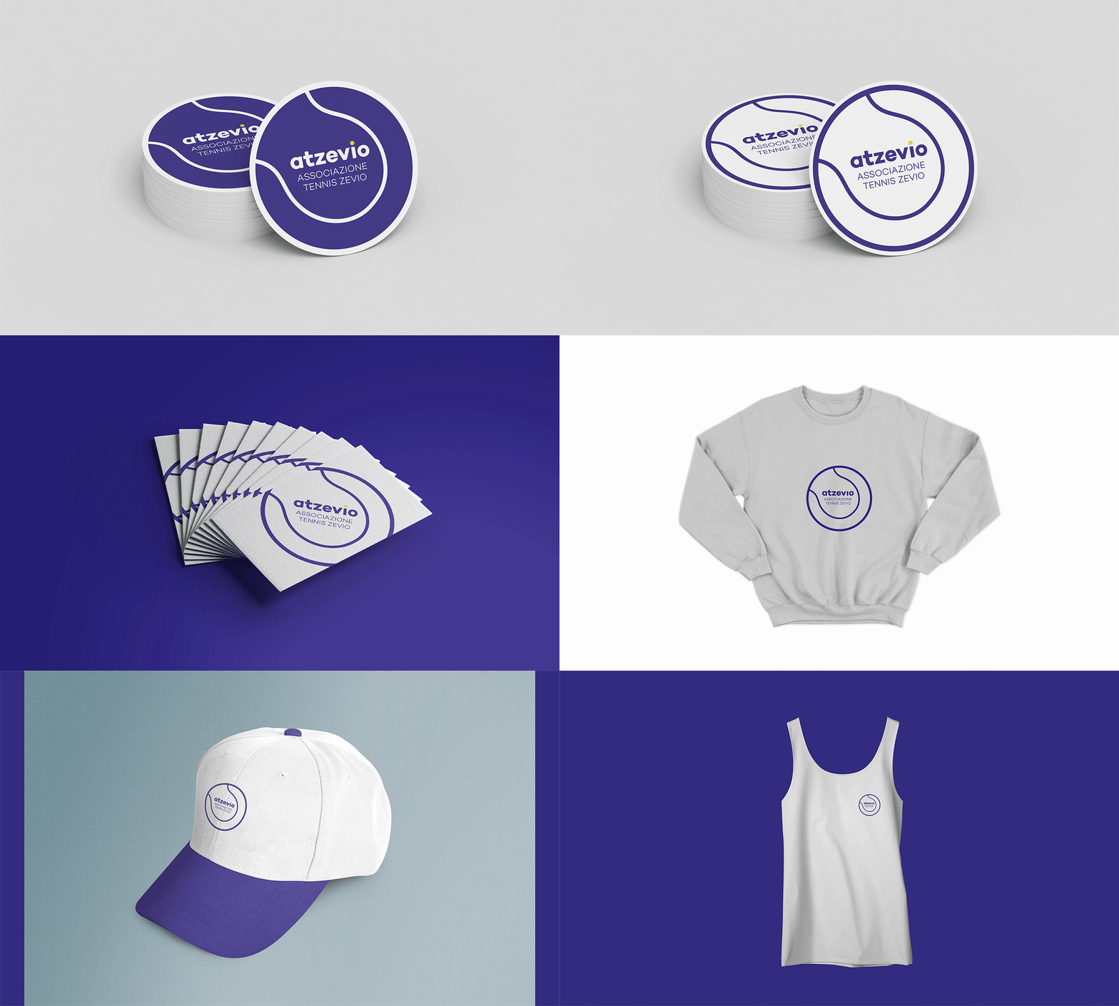
Atzevio is a tennis association that underwent a rebranding focused on a key element of the sport: the tennis ball. The new visual identity features a bold design and a color palette inspired by vibrant tennis courts, using shades of green and yellow to create an engaging look.
The circular shape of the tennis ball influences both the typography and graphics, resulting in a modern and sleek design that embodies movement and agility. This rebranding enhances Atzevio's visual presence while reinforcing its connection to the sport and its community.
Visual Identity
Business card n. 01
Business card n. 02
Business card n. 03
Business card n. 04
Hoodie n. 01
Hoodie n. 02
Cap n. 01
Cap n. 02
T-shirt n. 01
T-shirt n. 02


